Project Overview:
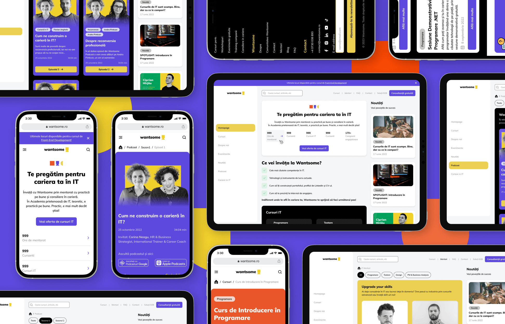
The Wantsome website redesign was a strategic effort to improve the online experience for an IT academy specializing in courses across software development, data science, and cybersecurity. The primary goals were to:
Enhance usability, ensuring users could easily navigate the site and find relevant courses.
Modernize the visual design to reflect contemporary aesthetics and build trust with prospective students.
Prioritize a mobile-first approach to cater to the growing number of users accessing the site on smaller devices.
As the sole designer, I led every phase of the project, from user research and defining pain points to crafting the final high-fidelity designs. Over the course of 3 months, I collaborated closely with stakeholders and developers, using Figma as the primary design tool to deliver a cohesive, user-centered solution.
Decoding the Needs of Future IT Pros
Understanding User Needs: Research & Discovery
To ensure the redesign addressed real user frustrations, I conducted a thorough research phase consisting of:
User Feedback Collection
Gathered insights from current and prospective students through surveys and interviews.
Identified key pain points related to course discoverability and mobile usability.
Noted that users came from diverse professional backgrounds, including career changers, recent graduates, and experienced IT professionals looking to upskill. This meant the site needed to cater to users with varying levels of technical familiarity.
Traffic & Behavior Analysis
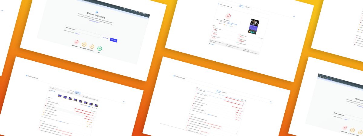
Analyzed website analytics, revealing that 75% of visitors accessed the site from a mobile device, yet the existing design was not optimized for smaller screens.
Found that a significant percentage of users dropped off before reaching course details, suggesting friction in the navigation process.
Competitive Analysis
Reviewed competitor websites to identify best practices for structuring course information and optimizing the user journey.
Noted that more successful platforms had clearer navigation structures and stronger mobile experiences.
Pinpointing the Pain Points
Defining the Problems
Through research, I identified two critical challenges affecting user experience and business outcomes:
1. Confusing Navigation
Users struggled to locate specific courses, leading to frustration and site abandonment.
Course categories and filtering options were unclear, making it difficult to compare offerings.
2. Poor Mobile Adaptability
The website was not designed with a mobile-first approach, leading to a cluttered and frustrating experience on smaller screens.
Key actions, such as enrolling in a course or accessing course details, were not easily accessible on mobile.
From Vision to Execution
Design Process & Solutions
To address these issues, I developed a structured design approach:
Ideation & Planning
Explored potential solutions using the "How Might We" framework to generate ideas and refine design directions.
Sketched out initial navigation concepts based on user needs and business goals.
Worked closely with stakeholders to align design objectives with business priorities.
Sitemap & Information Architecture Redesign
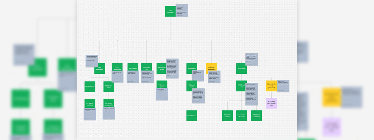
Simplified the course navigation structure, introducing clearer categories and an intuitive filtering system.
Designed a mobile-first layout, ensuring seamless adaptability to different screen sizes.
Implemented a bottom navigation menu on mobile to enhance accessibility to key sections.
Wireframing & Prototyping
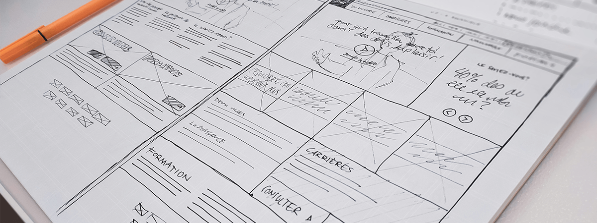
Created low-fidelity wireframes to validate the new structure before investing in detailed UI design.
Developed interactive prototypes in Figma to test different navigation flows.
Conducted usability testing sessions with a diverse set of users, including both tech-savvy and non-technical participants, to ensure clarity and ease of use.
Visual & UI Design
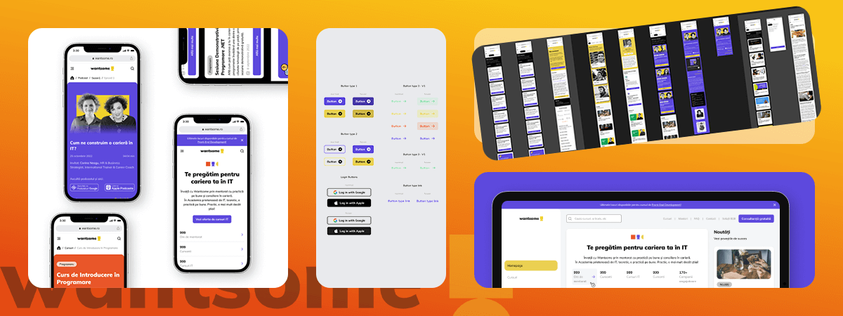
The final design phase focused on achieving a polished, pixel-perfect interface in Figma while ensuring the website worked flawlessly across all devices. I refined every component, maintaining visual consistency through reusable symbols rather than a full design system. Accessibility, readability, and touch-friendly elements were top priorities to enhance the user experience, particularly on mobile.
Created and organized symbols for UI components to ensure consistency across pages
DApplied a clean and modern aesthetic aligned with Wantsome’s branding while improving typography, spacing, and color contrast.
Designed intuitive interactive elements, ensuring buttons and menus were easily clickable on both desktop and mobile.
Optimized layouts for different screen sizes, testing and refining the mobile experience for smooth navigation.
Collaborated closely with developers to ensure precise implementation, conducting multiple reviews to maintain design accuracy.
Testing & Iteration
Conducted A/B testing with real users to compare the effectiveness of the new navigation versus the old version.
Iterated on designs based on feedback, further refining mobile usability and simplifying access to course details.
Worked closely with developers to ensure smooth implementation, addressing any technical constraints.
Delivering a Smarter, Smoother User Journey
Final Outcomes & Impact
The redesigned Wantsome website successfully addressed the identified pain points, leading to measurable improvements:
1. Enhanced Navigation & Course Discoverability
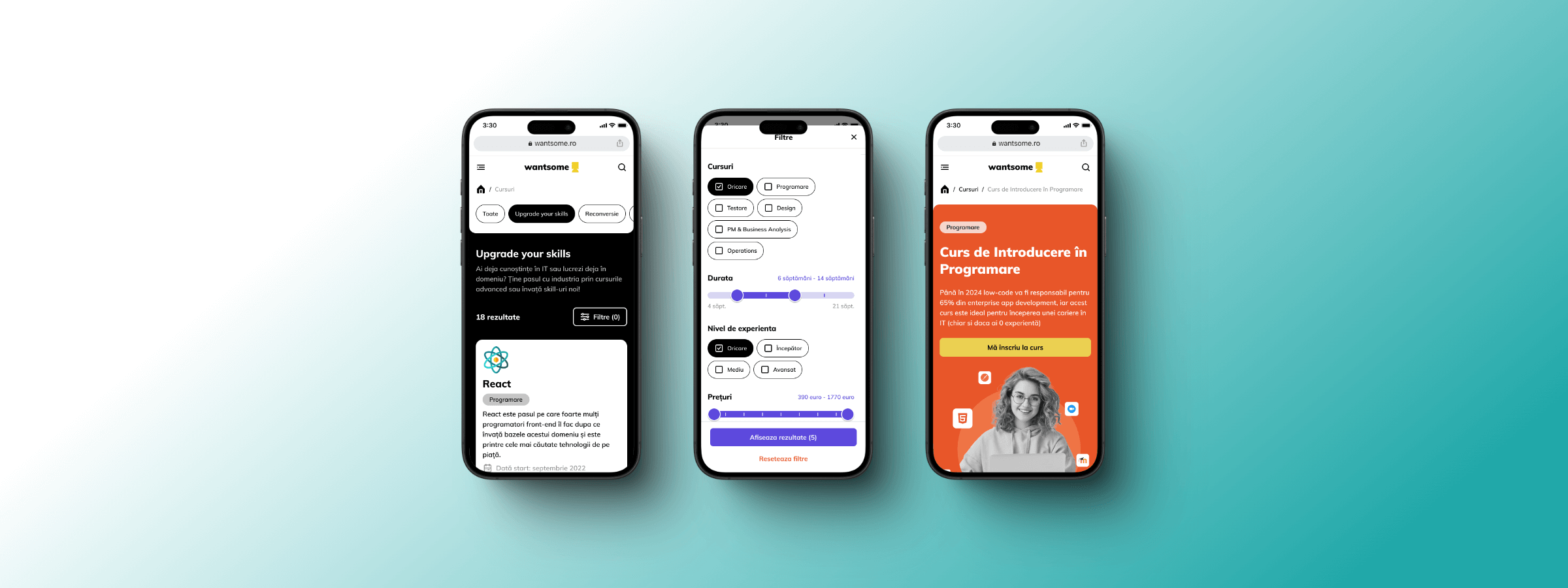
The introduction of a clearer categorization and filtering system reduced confusion and improved course findability.
User testing showed a 30% increase in successful course searches compared to the previous version.
2. Optimized Mobile Experience
The mobile-first approach resulted in a significantly improved user experience on small screens.
Bounce rates from mobile users dropped by 20%, indicating a smoother navigation experience.
Collaboration, Compromise, and the Road Ahead
Challenges & Lessons Learned
1. Challenges
Balancing Business & User Needs: The redesign required maintaining existing functionality while improving the UI/UX, leading to close collaboration with developers to ensure feasibility.
Catering to a Diverse Audience: The broad range of users (from beginners to experienced professionals) required a flexible design that was intuitive for all skill levels.
2. Lessons Learned
Early Research is Key: Conducting interviews, surveys, and analytics reviews before designing ensured that every decision was data-driven.
Testing with Real Users Matters: Iterative testing helped refine the navigation system and UI, leading to a final product that was significantly more user-friendly.
Cross-team Collaboration Strengthens Results: Working closely with developers and stakeholders ensured a smoother implementation and a design that met both technical and business requirements.
Conclusion
The Wantsome website redesign successfully transformed a confusing and outdated user experience into an intuitive, mobile-first platform. By addressing key pain points through research-driven design decisions, the project improved usability, accessibility, and overall engagement, making it easier for aspiring IT professionals to find and enroll in courses.
Related articles